Bethesda Architects & Remodelers Open Up a Home
“A Sympathetic Addition With Panache” – From House to Home Chapter One, Part Two
Opening the Space: Home Remodeling in Bethesda
At our next meeting, my design team began presenting ideas and alternatives, all within an open plan that removed the interior walls and captured the old patio space. Taking out the brick wall that blocked off the family room would be a huge visual relief, but it meant that a steel beam and posts were needed to take its place. In the final design, a bulkhead on the ceiling enveloped the beam, suggesting a visual boundary between the family room and adjoining spaces. A short wall at one end of the kitchen concealed one steel post; the other two were hidden in columns that framed the dining room. The old family room ceiling – a dark, quirky clapboard surface with low-hanging lights – felt low and confining; we suggested replacing it with white or off-white drywall and recessed lights. The design team also offered variations on a media center for the family room, as well as what eventually became an attractive dry bar. The mudroom entrance from the garage came together quickly, with coat hooks, shelves, and other storage in a tiled space with doors to the basement, backyard, family room, and garage.

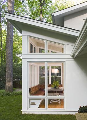
The butterfly roof is at the same
angle as the original gable roof
on the house, seen at right; only
the orientation is reversed.
As we talked through the transition to a more open floor plan, our clients were concerned about the mismatch between the old family room’s custom oak floor, made of random-width planks with contrasting wood pegs, and the new strip oak flooring in the rest of the space. Instead of finessing the difference, I suggested making a feature of it, using bands of dark walnut to mark the boundaries between the two flooring patterns. In the finished project, these walnut borders turned out to be a great success, serving as a kind of ghost outline of the old rooms. We changed the house, in other words, but left an interesting hint of where the interior walls had been.
Kitchen Remodeling in Bethesda
The kitchen, meanwhile, would be transformed. To begin with, we proposed opening the wall to the dining room, which was previously reached by a narrow door and pass-through window. A new row of base cabinets between the two spaces would shield the kitchen work surfaces from view. With the old brick wall removed along another side of the kitchen, a new kitchen island could now look out to the open family room, with space for stools on the side across from the kitchen. A large countertop, work sink, and plenty of storage would complete the island, which would be lighted by three pendants overhead. In general, our clients favored streamlined, upscale materials throughout the kitchen, including teak cabinets, stainless steel appliances, and polished black granite counters.
My female client wanted to be sure, however, that this remained a family kitchen, warm and inviting for all. In response, we developed its signature element – a playful yet sophisticated backsplash of mixed tiles in colors suggesting autumn leaves. Before the tiles were installed, a member of my staff worked onsite to plan the placement of the tiles in detail, creating a pleasing, seemingly random arrangement from the mix.
Interested in learning more? Read all of chapter one of our online remodeling book, From House to Home.
Be sure to check back soon – chapter one, part three is coming next!


